Get the Look: High Contrast Kitchen
 Get the Look Series:
High Contrast Style
is created with elements of bold color that are set off with white or light spaces. The finishing touch for this design style is the incorporation of a show-stopper that becomes the wow factor in the room. Accents should tie elements together and be a unique element on their own to complete the effect.
You can bring this design style to life in your kitchen if you make strategic decisions when you pick out color, counter tops, cabinets, tiles, finishes, and lighting. There is no one “right way” to do it but keep the factors below in mind.
Bold Color
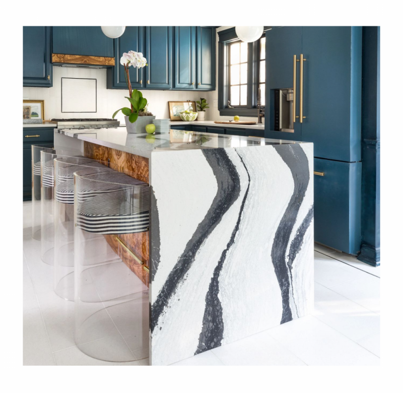
A high contrast design needs a bold color element to make it pop. One of the best places to incorporate a bold color in the kitchen is with the cabinets. The style of the cabinets will not achieve this look without color. Consider a blue like Sherwin Williams SW2412 Blue Bayou or a crisp apple green like Sherwin Williams SW1719 Apple Orchard.
Once you have decided on your cabinet color, your next choice will be a complimentary accent color. It will be the pop of color you incorporate in fun and surprising ways. Think seat cushions, small appliances, pictures, and storage baskets. Bhg.com offers 12 No-Fail Kitchen Color Combinations You Won’t Regret for even more inspiration.
Counter Tops
Counter tops should make a statement. Consider high contrast patterns that stand out, like Cambria Bentley. The bold black and white will add a sophistication and focal point that will compliment any bold color choice. Another great option for a high contrast look is the Cambria Inverness series, which is inspired by forces of nature.
The contrast does not have to be black and white. Any two color contrast will achieve the desired effect as long as it works with your other color choices. Avoid monotone or small patterned countertops if this is the aesthetic you want to deliver.
Back Splashes and Wall Space
This is where classic and clean should be implemented to let the other design elements shine. Traditional white subway tile is a perfect choice. Walls should be a crisp white as well. The absence of color will allow bold color choices and contrasting countertop designs to become art. Think of the back splash and walls as the neutral space in an art gallery.
Remember, however, that when it comes to paint, white is not created equally. Experiment with color samples to ensure that the undertone works in your kitchen. The undertone can range from gray to tan in a white paint and create a very different neutral.
Sherwan Williams has a great guide on How to Pick the Right White Paint.
The Unique Element
You need a piece that is the focal point of the kitchen. The obvious choice is an elevated kitchen island. Consider taking that beautiful countertop you selected and using it for a waterfall edge on the island or use a second contrasting pattern for it. Incorporate a complimentary but contrasting bold color for the island. Consider an island in your accent color.
BHG.com has 22 Contrasting Kitchen Island Ideas for a Stand-Out Space.
Accents
Finally, pick thoughtful accents that compliment your choices. Natural wood, like burlwood, can be used to trim stove hoods or as one side of an island. Brass hardware lends a timeless elegance and warmth. Both can be incorporated in to lighting design.
All of these design elements will equal one drop-dead gorgeous, showstopping high contrast kitchen.
Let the professional design team at Kitchens Redefined bring your high-contrast design to life!
Schedule your FREE consultation today!